The aSpire App – Case study
Project: Exam at Noroff UX design 2021 – 2023
Team: Gøril Eriksen, Inger Lise Isaksen and Rune Tyvold
Prototype: The aSpire app
Figma file: The aSpire App
FigJam file: The aSpire App
Delivery: Download assignment (PDF, size: 5,6 mb)

Finding work for a rookie can be difficult, time-consuming and frustrating. You don't have the skills or the experience – but you got your personality.

Introduction
For our project exam, we were tasked to develop a solution to help people who are struggling finding suitable work and explore the job search process for two target groups; Full-time or part-time students and digital nomads/freelancers.
We worked as a group and took part in every part of the process. I was responsible for the visual design and prototyping.
Overview of our process
-
The evolving project plan
-
Research goals and questions
Research methods
Literature review, survey and interviews
Data analysis
Insights and recommendations -
Empathise workshop
Primary and secondary personas
User scenarios
Problem statement -
Ideation workshop
Concept
Naming
Core features
Vision statement
Competitive research
Requirements
Analogue sketching
Information architecture and user flows -
Low fidelity prototype
-
Planning the usability test
Goal, scope, metrics and tasks
Recruitment
Conducting test
Analysis
Insights and recommendations -
Mid and high fidelity prototypes
Design system
Inclusive design -
Planning the usability test
Goal, scope, metrics and tasks
Recruitment
Conducting test
Analysis
Insights and recommendations -
Recommendations on how to proceed

Photo: Unsplash
The process in dept
1. Planning
We used a detailed project plan as a tool throughout the whole process and constantly iterated on it to ensure that we were up to date, but also to ensure we had taken in consideration all aspects of the delivery.
2. Empathise
A workshop was held and we narrowed down our initial thoughts and suggestions and landed our research goals and questions.
Research goal:
To create a useful solution to help students and freelancers to find flexible work in their area, we first have to understand who they are and what needs they have.
Primary research was interview and survey. The interviews gave us the possibility to dive deeper into the participants thoughts and made it easier to empathise with them. Secondary research was literature review and competitive analysis. These research methods gave us 272 facts that were thoroughly analysed.


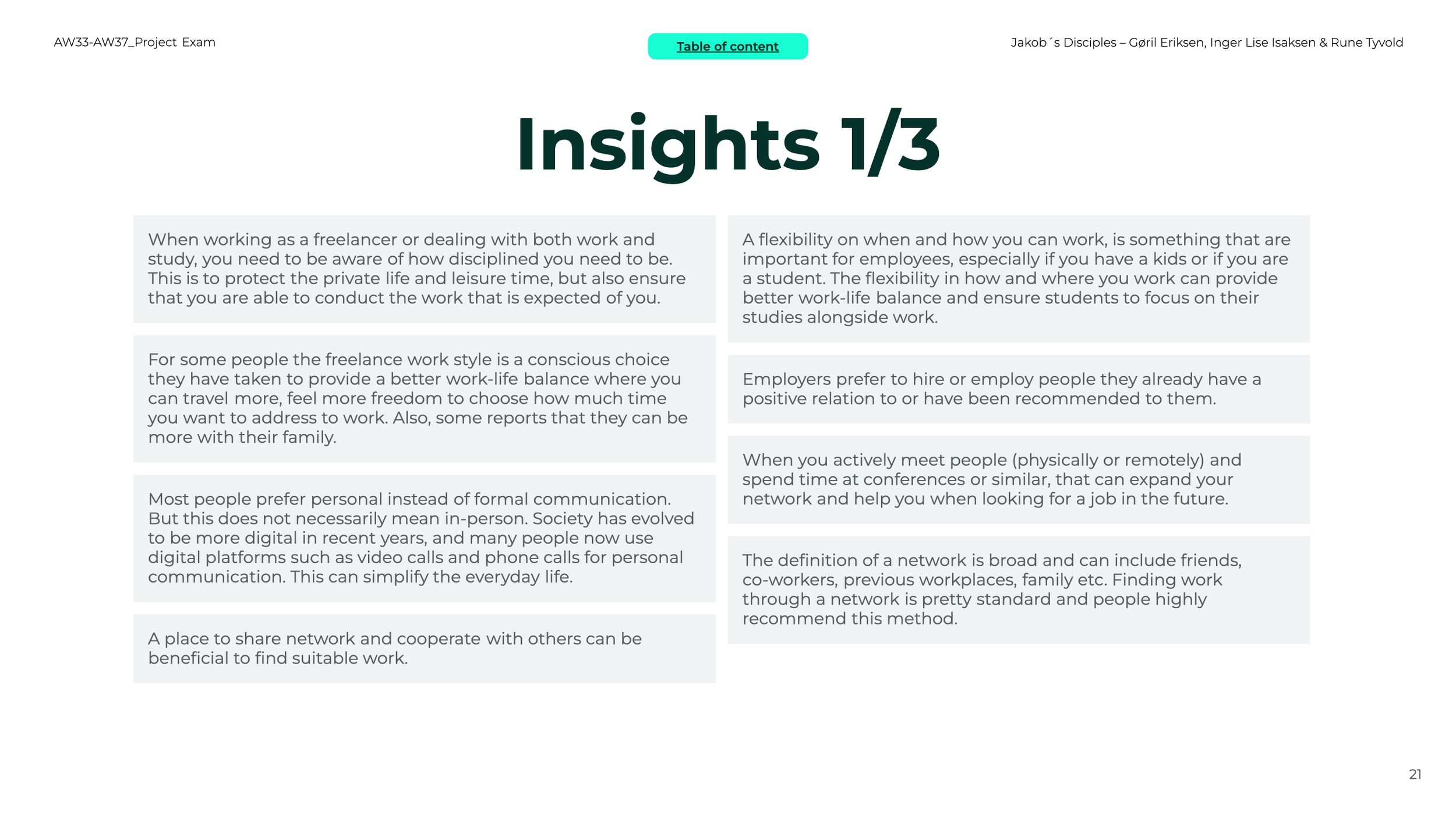


Recommendations:
A brief explanation of our recommendations is that we have to raise awareness amongst the employers that less experienced workers need to get the chance to show their skills and value. We also have to show the future employees the possibilities they have taking different jobs, being aware of the value of flexibility, both for the employees and the employers. Last we have to address the value of a network, and help newbies build this.
3. Define
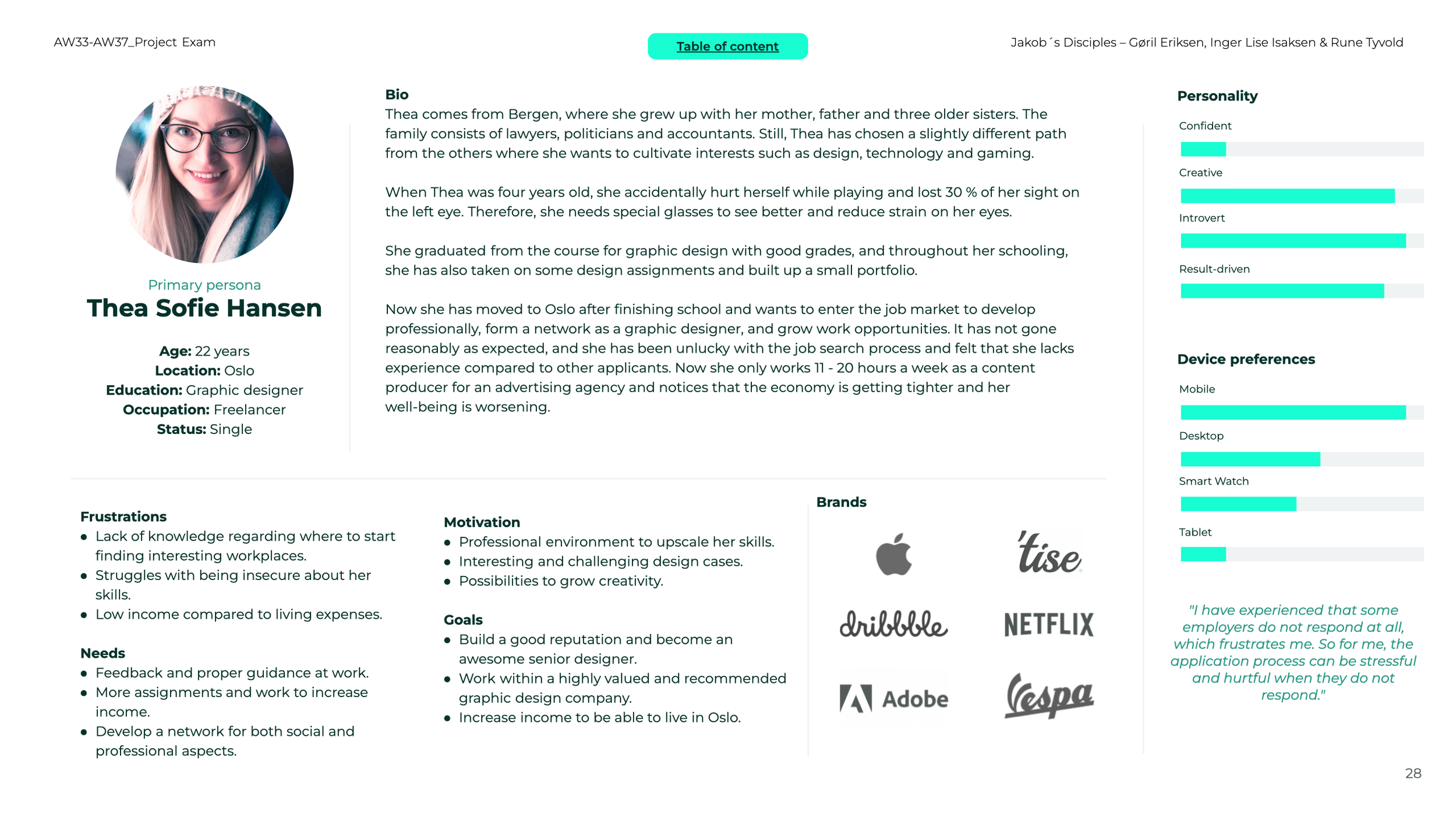
We held an empathise workshop in order to come up with realistic personas based on our facts. This resulted in a primary persona, 22 year old Thea Sofie Hansen and a secondary persona, 32 year old Christoffer Nguyen. These two were constantly referred to during every process. To further understand the personas needs and frustrations in the job search process, we also made realistic user scenarios.


After we finished the work with personas and their contextual scenarios, we started a workshop to define our problem statement. We used several angles like The Four W’s, Point of View and The Five Whys to come up with the best one.
Problem statement:
To address the challenges faced by less experienced individuals in finding suitable work and employers in finding the right employees, we can explore a solution that focuses on connecting these two groups more closely in a quick and effortless way.
This approach aims to bring awareness to each group's challenges and create mutually beneficial outcomes.
4. Ideate
We held an ideation workshop using both brainstorming and mind mapping and had to use divergent and convergent thinking in order to land good ideas.

Concept
As a result of this ideation workshop we landed our concept:
Finding work for a rookie can be difficult, time-consuming and frustrating. You don't have the skills or the experience. But you got your personality.
The aSpire is an app that aims to simplify the job search process for less experienced people. This is an easy matching-solution for rookies and employers, where mutual personality and values are the driving force for hiring.
Once the rookie has a match with a company, a video meeting takes place and a personal connection is made – a unique opportunity for the rookies to get a job based on who they are. Our solution will help the rookies expand their possibilities in a difficult labour market but also help the employers find people they would not have found through traditional methods.
“Hire for attitude, train for skills”.
Herb Keller
Co-founder of Southwest Airlines
Naming
The name aSpire comes from a combination of aspire (The hopes or ambitions towards achieving something), Spire (Sprout from Old english and Norwegian language) But also Spire which is something that points to the sky.
Core features:
A matchmaking system using an algorithm for both the employee and the employer (companies) that will let them find correct candidates based on personality tests. The employees and companies need to take the personality tests for finding the best matches for each other.
When reaching out to each other, they will have the possibility to make short remote video meetings where the employees have the chance to connect and present themselves to future employers.
A database where employers can broadcast their need for workers or announce available jobs.


Vision statement
To help people throughout the job search process by focusing on the value of their personality
5. Prototype (Low fidelity)
The flows and structure were our focus areas when developing the low-fidelity wireframes.
Low fidelity wireframes


6. Test Prototype (Low fidelity)
Planning the usability test
We decided to do formative research which collects qualitative data to seek improvements of the early stages of a design. Our design needed both attitudinal and behavioural research about what participants said, thought and communicated while they tested the prototype.
Recruitment
It was important to us in this test to meet several age groups from different places in Norway to support our idea that our target group are more “abstract” than a particular age group. Can it work for a person in their 40s who have recently completed further education, but also a 20 year old student?
Analysis:
The findings was once again tremendous! Our analysis in the affinity mapping needed four rounds of sorting before we felt confident regarding the overview and pattern we needed to extract the insights.
Recommendations
The sign up process needed to be changed to having the personality test first, then adding personal info. The homepage is overall a good experience for the users. It is easy to use, therefore we should keep the simplicity in mind through the whole app in general. Less is more!
Video meetings were effortlessly found through the Job ad and company page. The Video meeting page should be added common video functionality and the meeting time of 15 minutes seem to be enough. The process after the video meeting should be supported by the possibility to send messages and share attachments.
The Favourites feature should be kept as it is. Suggested New features were a bit fragmented, so just some should be added. The General feedback clearly indicated that this app can work in real life. The app really seem to be solving a real problem.
Next steps
Now that we had some improvements to deal with, we started our transition from low to mid-fidelity wireframes. It was too soon to jump into high-fidelity already


7. Mid and high fidelity prototype
Now that we had some improvements to deal with, we started our transition from low to mid-fidelity wireframes. We needed some discussions before delving into every page's details. After a couple of rounds of figuring out how to solve what our participants highlighted, we slowly changed our wireframes with more details.
Since we already knew that we should have one more round of testing, we agreed to conduct the last test on a high-fidelity prototype. But before we started on the high-fidelity level, we established more design choices regarding details on a mid-fidelity level. Choices regarding some of our colours, text, labels, design elements and other information arose in our mid-fidelity wireframes.
Mid fidelity wireframes


When we were done closing the gaps in our flows and had enough details about the mid-fidelity level, we started building a high-fidelity prototype.
Design system
To maintain a consistent design and ensure efficiency during design iterations and development of the concept aSpire, we gradually built an elaborate design system. We at all time through the development kept in mind Inclusive design and Accessibility – the visual design is centred around this.


High fidelity wireframes


8. Test high fidelity
Planning and conducting the High fidelity usability test
We agreed on executing a new round of formative research, and collecting both quantitative and qualitative data to analyse. We did use some of the same persons from previous tests. It was interesting to collect insights from people who have already seen some parts of the solution.
The test was executed remotely and with a script to ensure that every participant gave us feedback based on the same starting point. We approached to our test candidates with concurrent think aloud during the test, and afterwards we asked them our scripted questions using retrospective probing.
We managed to collect 14 insights and 9 recommendations from the test sessions. The analysis was made with the use of affinity mapping for both quantitative and qualitative data.
Recommendations
Simplicity is crucial for the app’s visual design and seem to match the users expectations and mental maps, and were not subject to any big issues. The Cognitive load is low and well balanced. The Introduction needs to be changes slightly by putting the form with personal information before the personality questions in sign up flow.
It seems that we have come a long way in establishing a solution that Connects employers and employees. Some works need to be done on perfecting and personalise the Statistics page so the users get relevant information here. The Map page is considered a useful feature to help the users expand their horizon.
Most users liked the simplicity of the sort-by-filter feature, and it is crucial to keep this in mind when we consider changing or adding more content and elements. The Calendar is a useful feature and the Utility of the app is high.
This is a app that can be very useful for the less experienced job seekers, but it also can be high value for the employers.


9. Next steps
To proceed with this project, we have to agree with the stakeholders on what recommendations to focus on further. We have to conduct more in-dept testing of the Accessibility and to make the solution more robust and sustainable and consider making aSpire operable with SmartWatches.
We know too little about how employers will think about this product because our main focus was on the job seekers. We suggest more research on this.
The process after the first video meetings need to be explored more to meet the needs of both employer and employee.
To make this product become reality, it is of course important to find willing investors.


Thanks for taking the time to read this case study, and do not hesitate to contact me if you need to know more.
Rune Tyvold, 28.09.2023